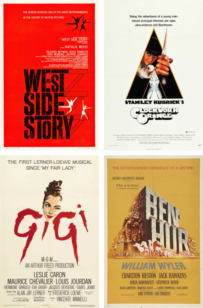
Some of the most memorable poster typography treatments in recent history.
Movie posters have been around for many decades. Originally fully illustrated by hand, the creating process has evolved into using more recent technology, photography, digital art, and mediums. Most movie posters will include text in some way or another. Whether it’s credits, opening date, cast, or titles and blurbs, typography has almost always been present in at least one iteration of the film poster.
Early typography artists used many tools that are now obsolete. While there has been a recent resurgence in the styles and ways of the past as nostalgic practices, most film posters are made with modern technology. Originally, type treatments were built by hand and revised to then be copied over as needed. Painting letterforms on glass was the standard way to make typography part of the moving image. The camera would film through the glass, revealing the background but the letterforms were solid and scaled to read perfectly on the film’s frame. This is done with computer software today and it’s even possible to do this directly from your mobile device as well, thanks to apps like Instagram, Facebook, Adobe Express, Canva, etc.
These are 6 of the most compelling type treatments in movie posters in recent history:
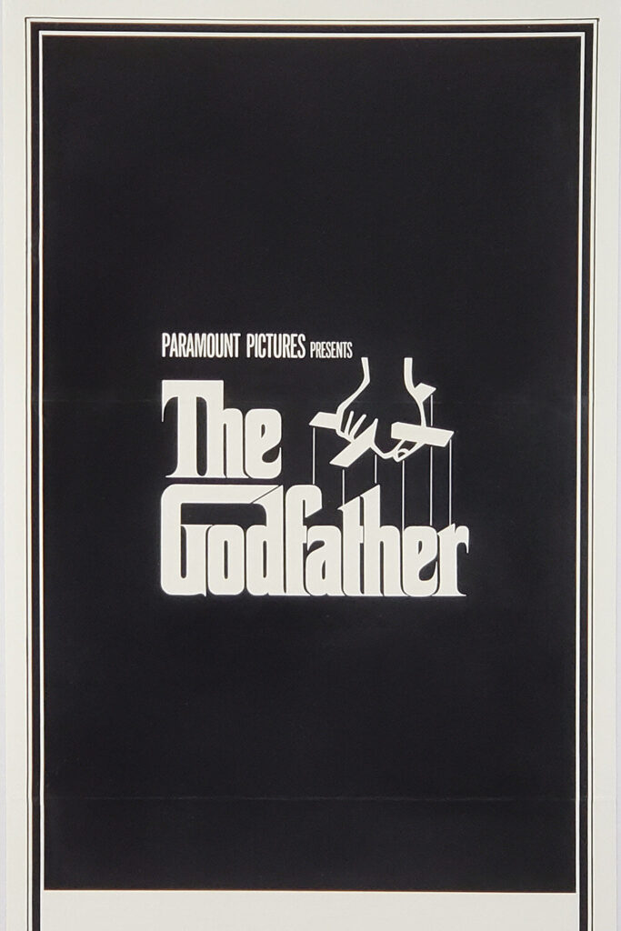
The Godfather (1972)
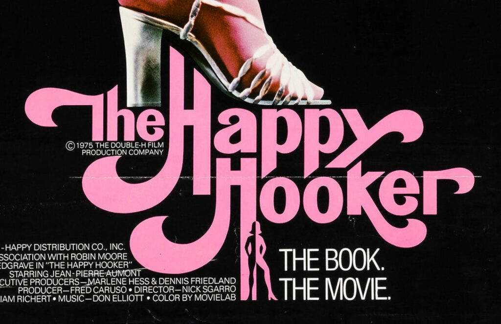
The Happy Hooker (1975)
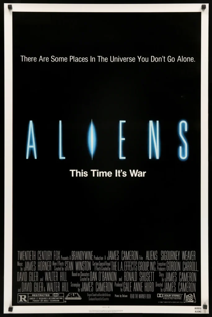
Aliens (1986)
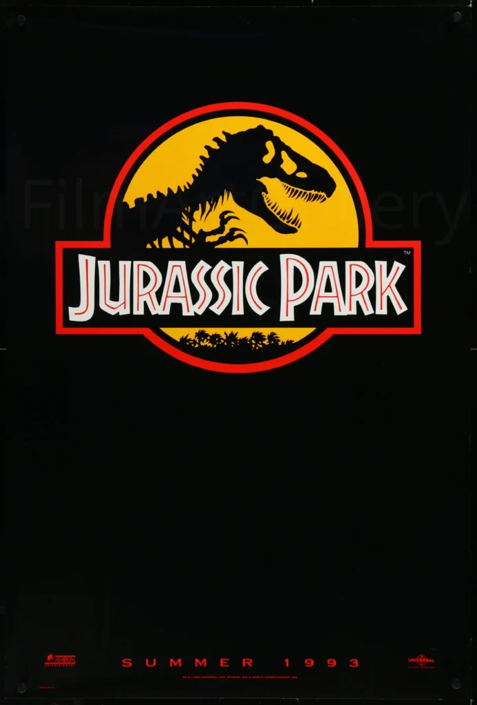
Jurassic Park (1993)
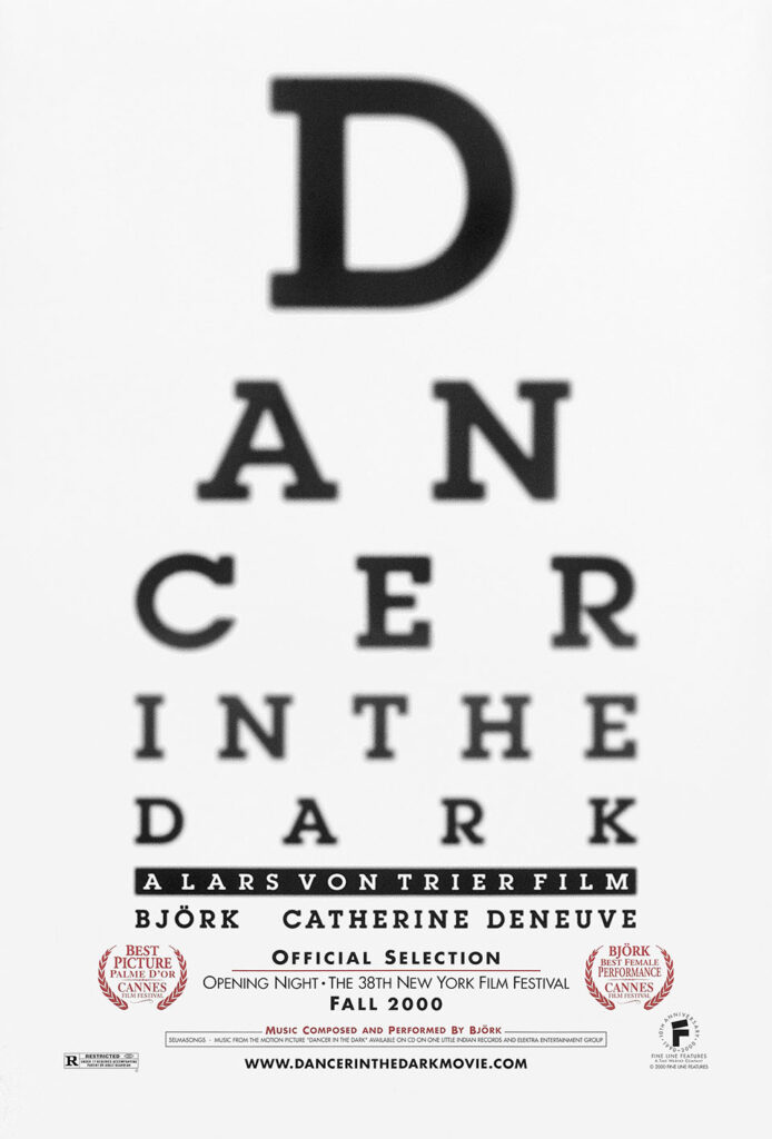
Dancer in the Dark (2000)
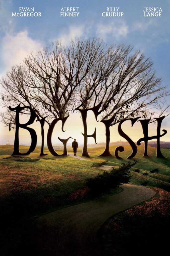
Big Fish (2003)
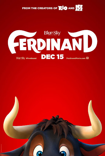
Ferdinand (2017)
There are a lot more posters that have iconic typography being produced today, but we would be here for days. What are some recent type-forward posters that have caught your attention? What type treatments are the most successful? While you think about all this, check out our curated list of free scary fonts.
Sebastian Chapman
Graphic Designer | Illustrator
