It sounds like you’re on a quest to discover the ideal logo design for your brand! Many successful brands utilize multiple logo variations—typically two to three—to capture different aspects of their identity and maintain flexibility across various platforms and contexts.
To help you navigate this exciting journey, I recommend exploring seven standout logo designs most used within brands. Each of these logos not only serves as a visual representation but also conveys a deeper message about the brand’s values and mission.
I’ll break down how these logos reflect the essence of other companies, showing their unique characteristics and the strategic choices behind their designs. By examining these examples, you’ll gain insights into how to select or create a logo that truly resonates with your audience and embodies the spirit of your brand. Let’s dive in!
Word Mark Logo:
This consists of only using the company name stylized font. Deciding which is the best typography for your brand is really important. Font give a tone and its important to know which tone your brand gives. The best way to better understand the right font for your brand is to currently look up other brands logo fonts and find the best one that suite your brands value.

If you still need help understand what is typography? and what is the best font for your brand?
Here is a YouTube video “Typography Guide – How to Choose Fonts” that will best explain it.
Pictorial Mark:
Pictorial marks are effective for companies that want their logo to be instantly recognizable without relying on words, aiming for simplicity and memorability. Pictorial Mark is an Image or symbol to represent the brand and its value. The image in a pictorial mark is usually designed to become a standalone icon associated with the brand over time, so it’s especially beneficial for brands that aim for a global presence or visual recognition across languages. Below you will find a few popular brands that stand out through their Pictorial Logo Mark.

Emblem:
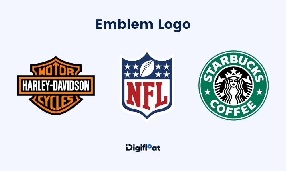
An Emblem is a logo detail that shows a shape commonly associated with traditional or established brand. Although, you may think hmmm… what makes an emblem different from pictorial logo mark. a Pictorial logos focus on a standalone image that captures the essence of the brand, while emblem logos combine text and imagery to create a more elaborate and cohesive design. Choosing between them depends on the message you want your brand to communicate and the impression you wish to leave on your audience. Use the Pictorial reference above and the Emblem reference below to understand and identify the difference between the too.

Abstract Mark:
An abstract logo mark is a type of logo that uses geometric shapes, forms, or conceptual imagery to create a unique symbol representing a brand. Unlike pictorial logos, which use recognizable images, abstract logos use shapes or symbols that don’t directly refer to any specific object or idea. This allows for a high degree of creativity and flexibility, as the design can convey a brand’s identity or values in a way that’s open to interpretation.
Key features of abstract logo marks include:
Memorability: A well-designed abstract mark can create a lasting impression that’s visually distinct, even without being literal.A design that uses abstract shapes and lines to convey the brand’s personality or values without relying on Typography.
Non-Representational Design: These logos don’t depict real-world objects; instead, they use shapes, colors, and patterns to evoke feelings or ideas.
Flexibility: Abstract marks allow for distinctive branding without being tied to specific imagery. This is especially helpful for brands with a wide variety of products or services.
Brand Examples Shown Below:

Mascot:
Mascot Logo Mark is a logo that incorporates a character or illustrated figure as the central element of the brand’s identity. Unlike other types of logos that might focus on abstract shapes, symbols, or text, a mascot logo features a character that represents the brand’s personality, values, or spirit in a friendly and approachable way. Designing a relatable character logo. This creates a more friendly approachable image. It also allows brands to create an emotional connection with their target audience. This is another way yours audience can recognize you even with just a mascot.

Combination:
Combination logo is when you combine text and symbols or mascot, allowing versatility and flexibility in different brand applications. This mark also helps to enhance the brands messaging.

I hope this guide helps you find the perfect logo mark among the six main types. Understanding each style and the unique ways they connect with audiences can empower you to choose a logo that not only represents your brand’s identity but also builds a stronger emotional connection with your audience. Choosing the right logo mark can influence how your audience perceives and remembers your brand. By aligning your choice with your brand’s personality and values, you can create a logo that resonates deeply, builds trust, and enhances brand loyalty.
Play with Color This F


