The Case for Limited Color Palettes in Graphic Design through the lens of Jacqueline Casey.
First, let me overstate that I adore color. When I work in my designs I start in black and white. I like to first get an idea of how compelling the asset, graphic, image, or illustration can be when it does not have color. After the initial design has been finalized, I will start creating a swatch group or start placing single color into my work. In my Illustration work I rarely start with a preset palette; I like to let my imagination give its own color vision and then I will edit if necessary.
In my graphic design work, a palette is usually selected or provided first, but I will still start the design in black and white. If I am working on my own vision, then I will create a mood board or pull colors from an image that I think will fit the design aesthetic.
I put color in almost every piece that I create as a designer.
I love color, it’s true, but I also believe that black is a color and so is white (this helps me relax when I must use a limited color palette, so I have more “colors” to play with).
Here are 10 of the best Jacqueline Casey posters that use a limited color palette successfully:
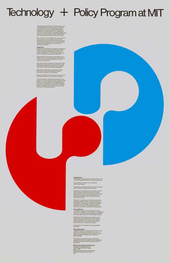
1. 1979 – MIT Master of Science Program in Technology and Policy
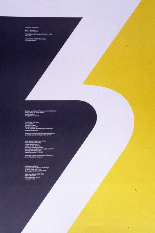
2. 1985 – Three Exhibitions
3. 1983 – Give Blood

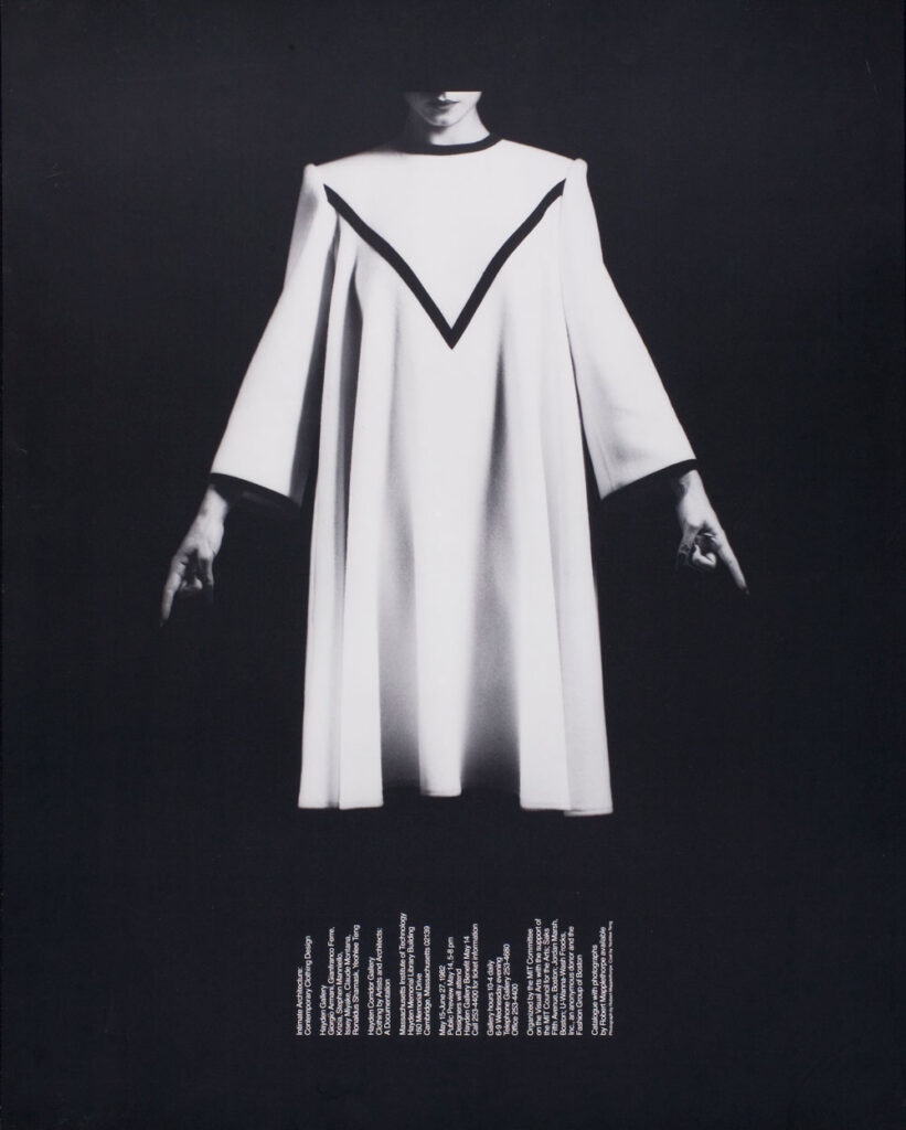
4. 1982 – Intimate Architecture Contemporary Clothing Design
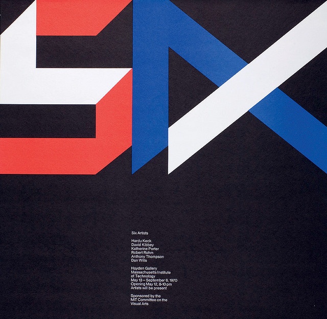
5. 1970 – Six Artists
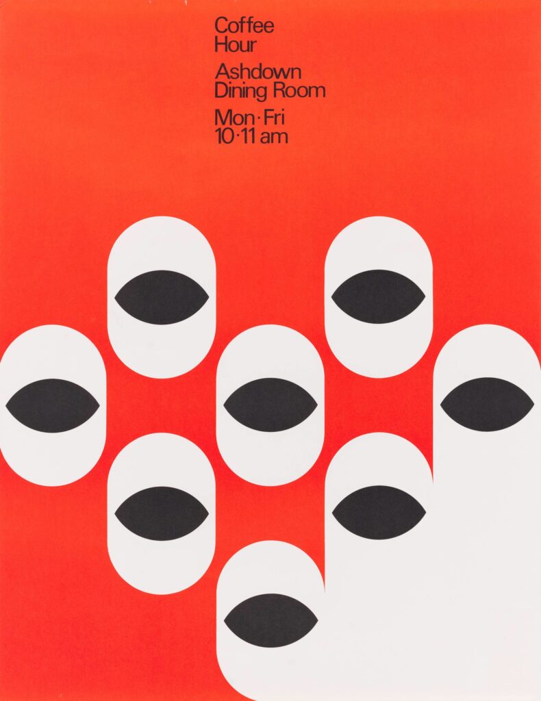
6. 1979 – MIT Coffee Hour
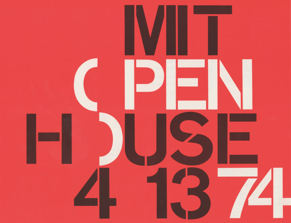
7. 1974 – MIT Open House. Jacqueline Casey.
8. 1969 – The Moon Show. Jacqueline Casey.
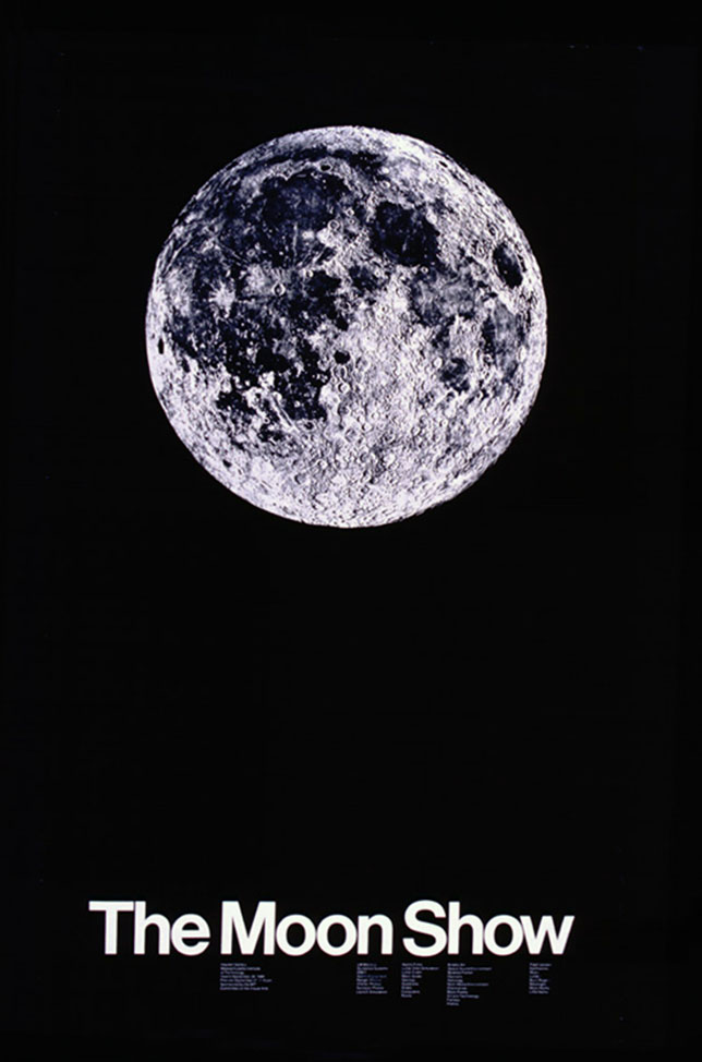
9. 1973 – Boston Visual Artists Union Poster. Jacqueline Casey.
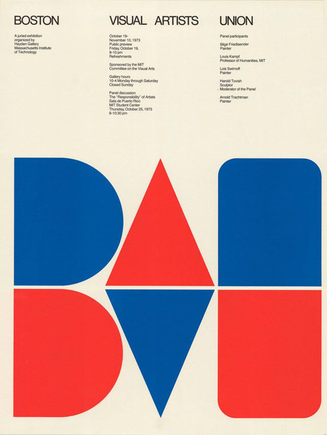
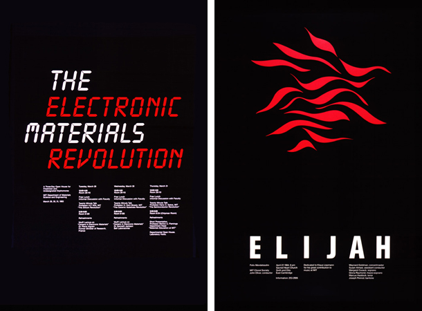
10. 1984 – Elijah. Mendelssohn Concert. Jacqueline Casey.
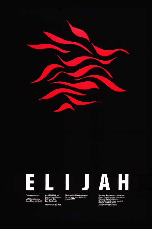
Look at the rest of Jacqueline Casey’s Collection at RIT.
